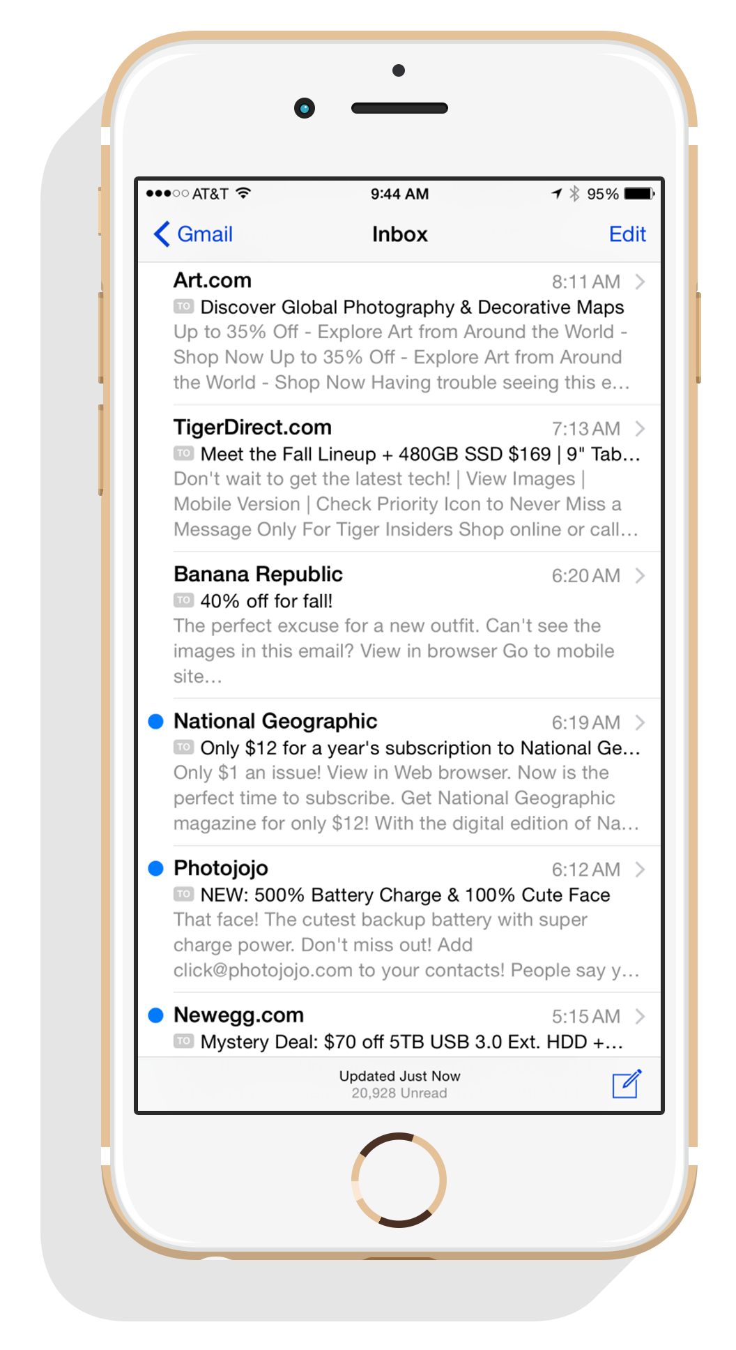
Mobile opens now 53%

53% of emails are now opened on mobile according to the latest findings by Litmus. The growth of email opens over the last few years has been explosive to say the least.

53% of emails are now opened on mobile.

In 2011, responsive web design was still an emerging trend, and responsive emails weren’t even a thought. Litmus reports that email opens were a mere 10%. This grew to around 30% in 2012 and then 43% a year later. As of January 2015, Litmus reports 53% of emails opened on mobile.

Mobile Opens

2011

10%

2012

30%

2013

43%

2014

43%

2015

53%
iPhone 6 inbox

iPhone ranked #1 email client

According to the same study by Litmus, a ranking of the top 10 email clients for 2014 positioned iPhone at the top of the list at 28%. This was followed by Gmail at the #2 spot (16%) and Apple again with the iPad at #3 (12%).

Your customers are using iPhones

This means your emails need to be readable and usable on iPhones.  While iPhones won’t crop your emails, they will scale down non-responsive emails to fit the screen. This means everything becomes smaller and less usable (see example below).  They need to be responsive.

Responsive emails perform better

When you look at a non-responsive email compared to a responsive email, it’s easy to see why it would perform better.
But let’s look at some stats which further support a responsive approach:

  • Responsive design results in a 15% increase in unique clicks for mobile users. – litmus
  • The first link in responsive emails on mobile have a 30% higher click rate than non-responsive emails. – litmus
  • 80% delete emails not optimized for mobile. A consumer survey by BlueHornet in 2013 revealed the following actions for users who get a mobile email that doesn’t look good. 80% delete, 30% unsubsribe, and only 13% will look at it on their computer. View the full BlueHornet report.